Cascading stylesheets control the way your document looks in the browser. The reason for the name style sheet is obvious. The term cascading comes from the fact that multiple styles (and indeed stylesheets) can be used together and their contents are merged, or cascaded from the general to the particular, in order to arrive at a final style for a particular element of your document.
The style sheet means that your HTML code does not become cluttered with styling information. If your website is controlled by a single stylesheet, you can completely revamp the look of your website just by changing the stylesheet. People with special needs, for example a visual impairment, can override your stylesheet with one of their own, which might produce large text in highly contrasting colours.
The style sheet information is stored in a file. This file is referenced by a special tag inserted into the head section of your HTML document.
<link rel="stylesheet" href="stylesheet.css" />
The href attribute refers to the name of the style sheet file. In this case it is called stylesheet.css. Cut and paste this line into the head section of your own html document.
Cut and paste the information below into a text editor and save it as a file called stylesheet.css in the same directory as your HTML files. Alternatively, you can save the file directly to disc by clicking here.
body {font-family: Arial, Helvetica, sans-serif; font-size: 12pt; background-color: white; color: black;}

h1 {font-family: serif; font-weight: bold; font-size: 200%; color: #00ff00; }

p.example {background-color: #cccccc; padding: 12pt;}

a {background-color: white;}

a:link    {  font-family: Arial, Helvetica, sans-serif; text-decoration: none; color: blue;}

a:visited {  font-family: Arial, Helvetica, sans-serif; text-decoration: none; color: navy;}

a:hover   {  font-family: Arial, Helvetica, sans-serif; text-decoration: none; color: red;}
As well as editing the basic styles for the html, you can define your own. In the stylesheet.css file, there is a style for p.example. This will control the style of all paragraphs marked up as
<p class="example">
and will add a grey background colour, and some padding (space) around the edges of the paragraph.
So, by adding a class="somename" attribute to your html tags, you can define styles which will only apply to a tag in special circumstances.
You may have noticed that the entries in the navigation menu at the top of this page change colour as you move the mouse over them. This
has been achieved by defining a style called a.nav in the stylesheet, and then specifying the links as <a href="wherever" class="nav">.
The cascading style sheet reference also shown on the links page gives a complete list of all the properties you can control with a stylesheet. Naturally, you will want to define styles which make your document look as good as possible, but you should consider the following when defining styles:
Dimensions used in stylesheets can either be specified relatively (which means as a proportion of the corresponding size of the parent element) or in absolute terms. The most often used relative dimension is the percentage, whilst absolute dimensions are specified most often as pt (points) for text, although inches (in), centimetres (cm) and millimetres (mm) are available.
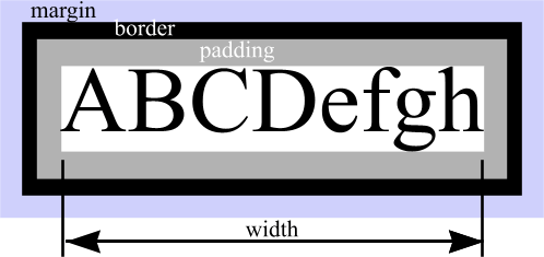
When specifying margin, border and padding settings, the following diagram may be of use.
Your data (e.g. some text) is surrounded immediately by an area known as padding which shares the same background colour you specify for the data. Surrounding the padding is the border (which in many cases will be of zero size, and invisible) and then outside the border - essentially creating some free space between this element and the other elements of the page - is the margin. The margin is transparent, so the background colour will be that of the parent element - for example, the main page body background colour. The sizes of the border, margin and padding can either be specified in terms of of values for top, bottom, left and right, or as a single figure which controls all four sides. e.g.
margin-top: 3px; margin-left: 6px; margin-right: 2px; margin-bottom: 6px;
padding: 8px;
Specify as little as possible in stylesheets. If you set the body font to be helvetica, and you want the h1
elements to be shown in a bold version of the same font, just specify font-weight: bold; rather than repeating the
font-family definition as well. That way, if you want to change to another font, you just need to change the body specification
and all other elements will inherit the new font without having to have their style definitions changed.
When specifying a particular class of style where a parent element (e.g. a table) may have child elements (e.g. a table cell) with a corresponding style, it is possible to individually identify each element like so:
<table class="myclass">

<tr><th class="myclass">Heading 1</th><th class="myclass">Heading 2</th></tr>

<tr><td class="myclass">Data 1</td><td class="myclass">Data 1</td></tr>

</table>
The stylesheet would have definitions for table.myclass, th.myclass and td.myclass. Whilst this gets the job done, you will soon tire
of typing class="myclass" in your html.
A neater solution is to specify the styles in the stylesheet like this:
table.myclass {background-color: white; border: black; }

table.myclass th {background-color: yellow;}

table.myclass td {background-color: gray;}
This tells the browser to draw all th and td elements which it finds inside a <table class="myclass">, in the specified styles, without having to repeatedly type class="myclass" for each td and th element. So the html code would become much neater:
<table class="myclass">

<tr><th>Heading 1</th><th>Heading 2</th></tr>

<tr><td>Data 1</td><td>Data 1</td></tr>

</table>
Use the stylesheet you downloaded from higher up this page in conjunction with the stylesheet reference to style a page to your tastes. The Web Palette shows which colours you can safely use (computer displays with only 256 colours available are likely to be able to display the colours specified).
Note that this course was written in 2003, and things have moved on since then! You might like to check out this site for a more up to date html overview.
© Dial Solutions 2003
Permission is granted to copy, distribute and/or modify this document
under the terms of the GNU Free Documentation License, Version 1.2
or any later version published by the Free Software Foundation;
A copy of the license can be found at www.gnu.org/copyleft/fdl.html